There’s a moment every designer knows well. You’ve spent hours perfecting a logo, a label, or a packaging concept — and then comes the awkward part: showing it to the world on a plain white background, flat and lifeless, like a passport photo of your best idea.
That’s exactly where a free mockup changes everything.
A mockup isn’t just a presentation trick. In the right hands, it becomes a conversion tool — something that makes a potential buyer feel the product before they’ve ever touched it. But here’s the thing most people miss: it’s not enough to just drop your design into a template and call it done. The magic is in how you use it.
Why Mockups Are the Silent Salespeople of Visual Marketing
Think about the last time you bought something online. Chances are, a lifestyle image — not a spec sheet — is what tipped the scale. People don’t buy products. They buy the version of themselves that owns the product.
A well-crafted mockup whispers that story. It says: this mug lives on morning kitchen counters. This tote bag goes to farmer’s markets. This phone case belongs to someone with good taste.
When you skip the mockup and go straight to a flat design file, you’re asking your audience to do emotional heavy lifting they simply won’t do. So let’s talk about how to make your mockup do the work instead.
Step One: Choose the Right Scene for Your Product
Not all mockups are created equal — and more importantly, not all scenes are right for every product. Before downloading anything, ask yourself:
- Who is my buyer, and what does their world look like?
- What emotion should this image trigger — aspirational, cozy, professional, playful?
- Does the background environment match my brand’s visual language?
A luxury skincare brand has no business living in a grungy urban flat-lay. A streetwear sticker pack looks awkward in a sterile white studio. Context is character.
Step Two: Prepare Your Artwork for Mockup Placement
This part gets skipped constantly, and it’s where most mockup results fall flat.
Before you place your design, make sure:
- It’s exported at the highest resolution your mockup supports (usually 300 DPI for print-style mockups)
- Transparency is properly handled — no white halos around edges
- Your color profile matches the mockup environment (RGB for screen, CMYK knowledge for print)
- The design is sized proportionally to real-world dimensions
A pixelated design placed into a photorealistic mockup creates cognitive dissonance. The brain says fake before the eye even registers why. Crisp assets are non-negotiable.
Step Three: Master the Smart Object — Don’t Just “Place and Pray”
Most professional mockups use Smart Objects in Photoshop. Double-click the layer, paste your design, save, and watch it wrap, shadow, and breathe like it belongs there.
But the real skill is in what happens after placement:
Adjust the blend mode. Multiply, Overlay, and Soft Light can make your design look printed rather than pasted. This is the single biggest difference between amateur and professional mockup results.
Work with the shadow layers. Many mockups include separate shadow overlays. Don’t delete them — they’re doing the three-dimensional storytelling. Reduce opacity if they’re heavy, but keep them alive.
Color-grade the whole composition. Add a subtle Curves or Color Balance adjustment above everything. Warm the shadows slightly. Pull the highlights toward your brand palette. You’re not editing a photo anymore — you’re directing a mood.
Real-World Examples: Free Mockups That Converted
Let’s get concrete. Here are scenarios where smart mockup use directly impacted results:
A candle brand launching on Etsy used a single free mockup — a frosted glass jar on a marble surface with soft morning light — and saw click-through rates double compared to their previous flat product photography. The secret? The mockup matched their “clean wellness” brand positioning perfectly.
A freelance logo designer presenting to a client dropped their concept into a storefront sign mockup and a business card scene. The client approved on the first round. No revisions. The mockup made abstract ideas tangible.
A Shopify apparel store replaced flat garment photos with lifestyle mockups showing the hoodie on an anonymous figure in an autumn park. Add-to-cart rates climbed noticeably within two weeks. Same product, same price, different story.
The pattern is clear: mockups don’t just display products — they provide purchase context.
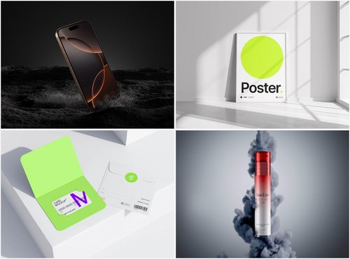
Free Mockups on ls.graphics: Where Quality Meets Accessibility
If you’re serious about visual output, the free mockup collection at ls.graphics deserves a bookmark — and genuine attention.
What makes these mockups stand apart isn’t just that they’re free. It’s the level of craft baked into every file. The renders are ultra-realistic, with lighting and shadow behavior that mimics actual studio photography so convincingly that even trained eyes do a double-take. Organized, clearly labeled layers mean you’re not wrestling with a Photoshop archaeology project — everything is where you’d expect it to be.
The variety is genuinely impressive: multiple angles per product, different color style options, and compositions that feel intentional rather than generic. Whether you need a top-down flat lay, a three-quarter perspective, or an angled hero shot, chances are the angle you need is already there.
The minimalistic styling is particularly valuable. Clean, distraction-free backgrounds put your design at the center — which is exactly where it should be when conversion is the goal. And because the aesthetic skews modern and sophisticated, these mockups work just as naturally for premium brands as they do for indie creators.
Perhaps most importantly: they’re genuinely easy to use. No tutorial required, no hunting for hidden layers. Open, place, export. That frictionless workflow matters when you’re on deadline or iterating through concepts quickly.
Conclusion: The Mockup Is the Message
Great design deserves great presentation — and in a visual-first world, how your product looks in context is just as important as what it actually is.
A free mockup, used thoughtfully, collapses the distance between design file and buying decision. It gives your audience permission to imagine ownership. And that imagination is where conversion lives.
Resources like ls.graphics exist precisely to remove the barrier between great ideas and great visuals. Use them with intention, prepare your assets with care, and remember: every scene you build is a silent pitch to someone scrolling past.
Make it count.


![RedAndWhiteMagz .com: All You Need to Know [2024]](https://www.smartmyths.com/wp-content/uploads/2025/02/jl-1.jpg)